A group of professionals shouldn’t be needed to build your internet business. Shopify gives you the freedom to take charge and become an expert in site design! Put an end to communication problems and outsourcing. Create a gorgeous Shopify website design that embodies your own brand and entrepreneurial vision by embracing the do-it-yourself attitude. Anyone can master the fundamentals and realise their e-commerce ambition using Shopify’s user-friendly platform. Let’s get started and discover how to create the ideal Shopify site from scratch!
Craft Your Dream Shopify Website Design in Just 5 Steps
1. Planning for Success
Creating a professional online store isn’t about endless complexity. Instead, start with a clear roadmap. Let’s introduce the concept of an MVP, or “minimum viable product.” This means launching your store with the essential features to collect valuable customer feedback. Just like Nike’s initial online store, your store can be refined and perfected over time based on real user input.
2. Choosing Your Theme
Now, it’s time to pick the foundation or “bones” of your store – the theme! Luckily, Shopify offers a vast selection of beautiful themes (both free and paid) in the Shopify Theme Store. To get started, sign up for a free Shopify trial (no credit card needed) and explore for the next two weeks! Before choosing your theme, consider these key factors- web design budget, the number of products you plan to sell, and your industry.
3. Adding Your Products
With your theme being selected, you should now look forward to adding products to your store! Head to “Products” and then “Add product” to create your first listing. Here, you’ll provide all the details that make your products shine.
4. Making it Your Own
After selecting a topic, let your imagination go wild! With the built-in tools, you may alter the appearance and feel of the pages in your store. You can change the font and colour scheme in “Theme Settings” to better reflect your brand.
Why Invest in a Stellar Shopify Website Design? Reap the Rewards!
1. Improved User Experience (UX)
Customers are more likely to stay engaged and click through a business with an easy-to-use layout. Customers are encouraged to return and convert when they have a great experience thanks to simple navigation, clear product information, and a seamless checkout procedure.
2. Improved Brand Image
Your brand identity and values are reflected in a well-designed design. Exceptional images, dependable branding components, and a unified colour palette help to establish your credibility as a respectable company.
3. Higher Conversion Rates
A well-thought-out business directs visitors to make the purchase you want them to. Smooth checkout procedures, obvious calls to action, and well-placed products reduce confusion and motivate customers to finish the transaction.
4. Better Search Engine Optimisation (SEO)
Search engines find websites with relevant content and a well-structured layout easier to find. This results in more potential customers finding your store and an increase in organic traffic.
5. Lower Customer Support Expenses
Customers are less confused in a store that is straightforward and informative. Provide comprehensive product descriptions, frequently asked questions, and easily accessible size charts to anticipate customer needs. This saves you time and money by reducing the need for customer service questions.
6. Competitive Edge
Having an eye-catching and user-friendly store helps you stand out in the congested online marketplace of today. Make a good first impression on prospective buyers by presenting your products in a professional manner.
By investing in an amazing Shopify website design, you’re investing in the future of your business. You’ll create a welcoming and functional space that fosters trust, increases sales, and helps you achieve your entrepreneurial dreams.
Shopify Website Design Inspiration
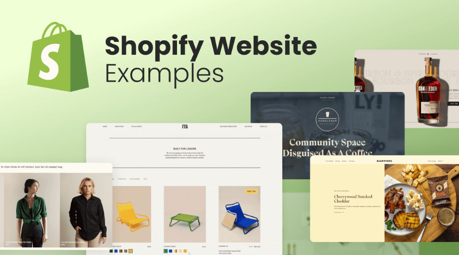
Looking to spruce up your website? Get inspired by these stunning Shopify website designs across various categories.
1. De La Calle Coffee
This coffee brand grabs your attention with a vibrant colour palette and a unique, bold font. High-quality product photos showcase their delicious brews in all their glory.
2. Snacklins
Proof that a beautiful website can still burst with personality! Snacklins utilises large sections to highlight engaging product details. From the illusion of falling chips to the distinctive fonts, this website sets itself apart from competitors.
3. Taddle Creek Magazine
This print publication uses its website to amplify its physical magazine. They feature custom graphics in their logo, favicon, and footer, all seamlessly integrated into the design. The minimalist approach with a prominent “Subscribe Here” button keeps the focus on the magazine itself.
4. The Spruce
Airy and light, The Spruce’s blog uses visuals that perfectly complement its brand colours. Custom graphics showcase social proof, and clear navigation makes finding articles a breeze. They also prioritise accessibility by avoiding auto playing videos.
5. Zenefits
This website utilises a captivating scrolling design to guide visitors through its features. The 3D elements make it more engaging than static content. Different coloured symbols cater to various target audiences, making Zenefits’ capabilities easily scannable.
6. Gorgias
Standing out from the crowd, Gorgias leverages a single, bold pink colour for key content like headings, reviews, and icons. This pops against the otherwise minimal colour scheme for a striking effect.
7. Beetle Beetle
This website demonstrates how interactive backgrounds can be implemented effectively. A simple colour palette with playful star symbols and subtle movement as you scroll keeps the design visually interesting without being overwhelming.
8. Kayla Hollatz
This freelance copywriter’s website is an example of building a beautiful platform around a personal brand. She utilises custom illustrations, adding a unique touch rarely seen on copywriting websites. Notice the consistent use of colour, even in the playful “Minnesota raised” footer graphic.
These are just a few Shopify website design examples to inspire your own website journey. Remember, the key lies in finding a design that reflects your brand’s unique personality and effectively engages your target audience. Happy creating!
Conclusion
Ready to take action? With the best Shopify website designs, steps to build them, and some inspiring examples, you’re well on your way to crafting a beautiful and functional Shopify store. Remember, a well-designed website attracts customers, boosts sales, and sets your brand apart. So get started today and watch your online business flourish!
For more information, visit Thesinstyle.


